


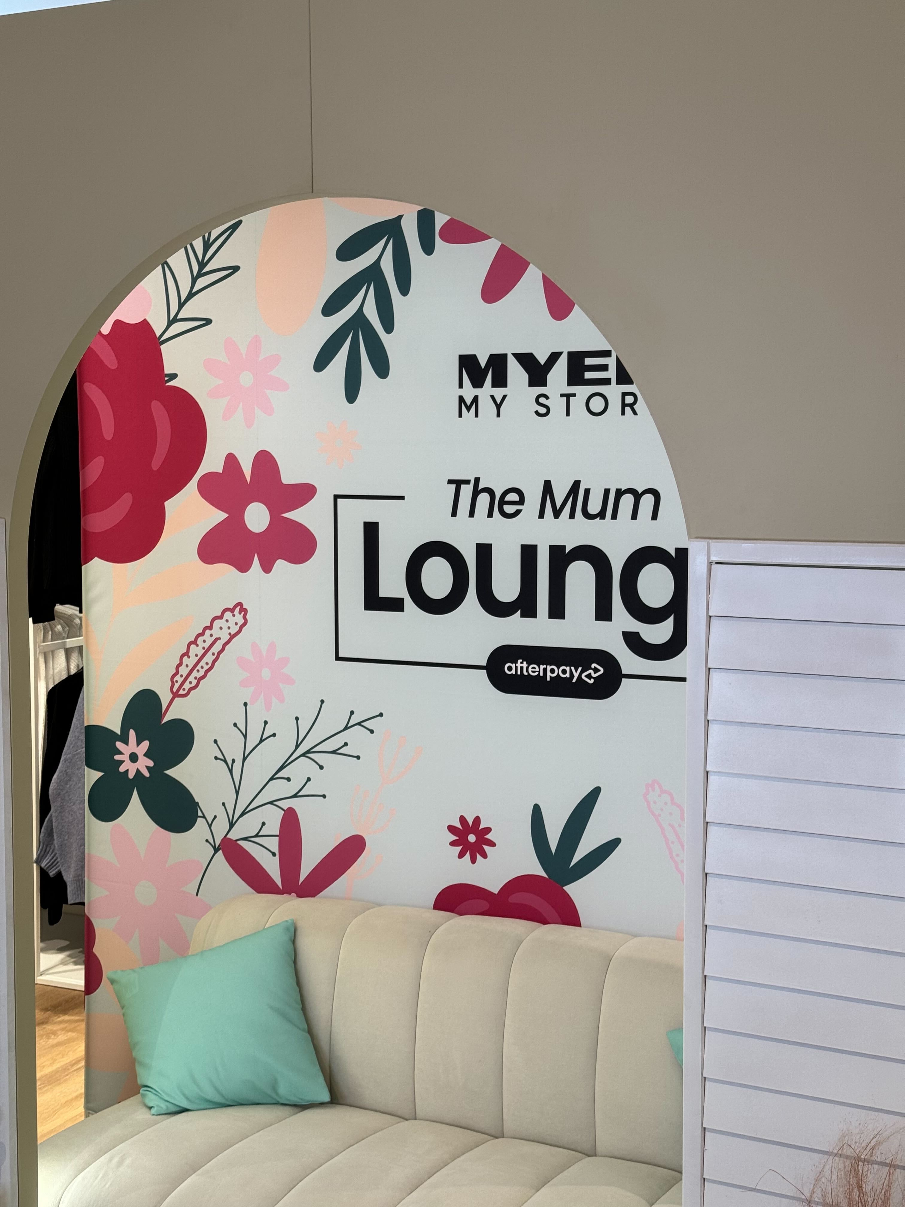

Myer x Afterpay
Mum’s Lounge
2024We were briefed by Myer and Afterpay to bring to life their ‘Mum’s Lounge’ concept across 5 locations and 3 states in Australia.
- Parramatta
- Sydney CBD
- Chermside
- Chadstone
- Melbourne CBD
I was responsible for the design and render of the activation build, graphics, on-site print media [backdrop, photo sleeves, hardware branding, stickers, vinyl decals], as well as translating the design identity into a suite of stunning shareable digital assets for Myer & Afterpay socials.

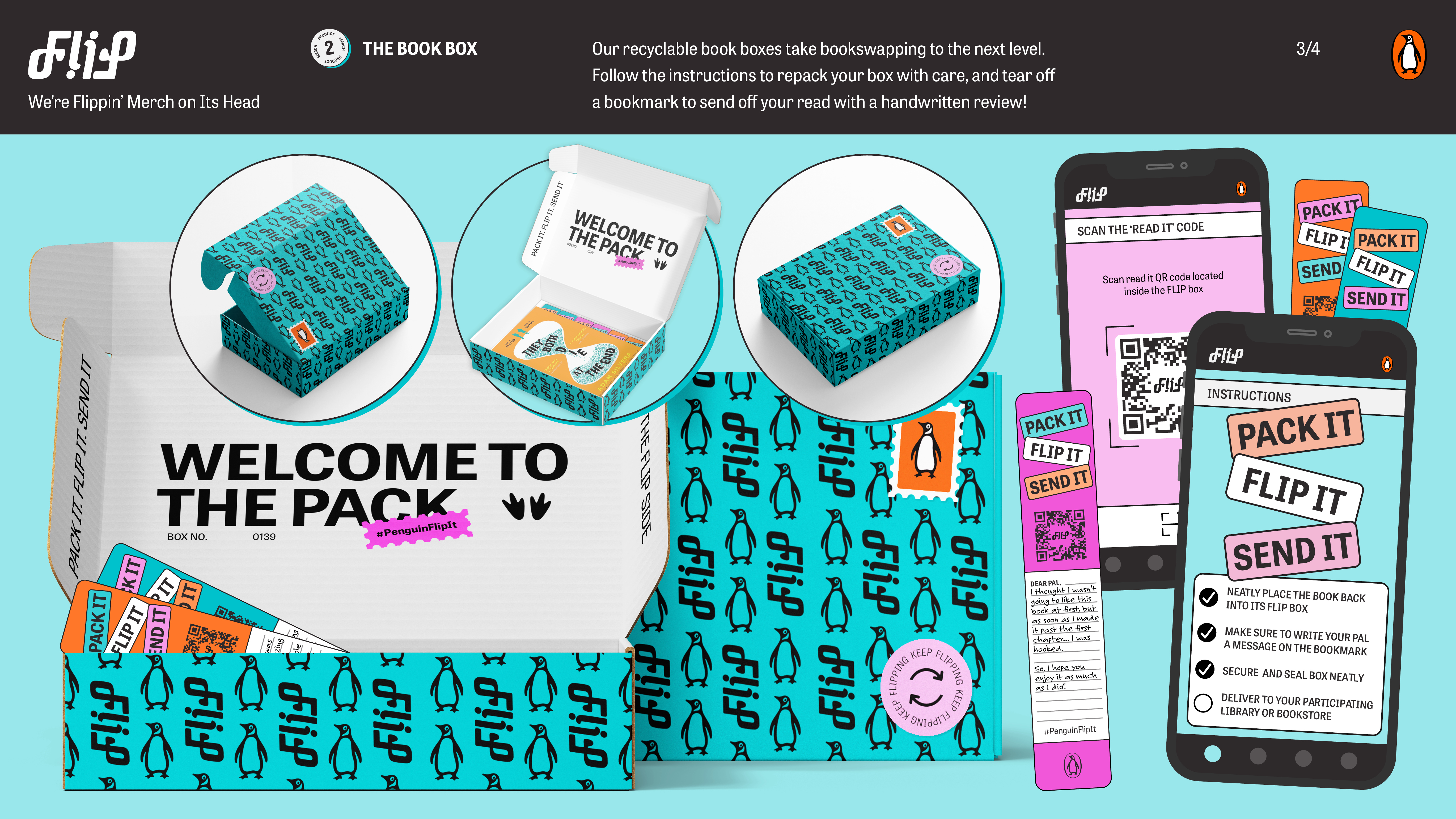
FLIP | Penguin Books
2023︎D&AD Yellow Pencil Winner
︎AGDA Student Brand and Identity Finalist
Gen Z believes that brands must be sustainable. So when it comes to merch, we don't want another tote bag—we want to do good. #BookTok has inspired a new age of reading and sharing literature, but with the world's biggest book club at every reader's fingertips, Gen Z is craving something more than merch.
Flip is reading done right. We're flipping merch on its head and reimagining book swaps for good. We're building a circular economy around the books you love, bringing you community and meaningful experiences. Let's flip it!
Design Team: Sophie Whitehead, Isabelle Trudgian, Ruben Savareigo, Sofia Locke


AFL Gather Round Festival Activation
2024AFL came to us with the challenge to produce a full-scale brand activation within a 6m x 20m space at Rundle Mall in Adelaide. Using AFL’s brand guidelines & Gather Round identity, their mission was clear: infuse the heart of Adelaide’s CBD with the electrifying energy and excitement typically reserved for match days at Adelaide Oval.
The activation area was meticulously adorned with a custom marquee, boasting custom-branded gables and an array of secondary elements including backdrops, flag banners, and custom merch bins. I was solely responsible for the design & print of all installed elements & hand-outs. My designs reached over 10,000 attendees over the week of the activation.


Don Quixote; a modernist equilibrium
2022
︎ISTD- International Society of Typographic Designers 2022 Merit Award
Quixote carries himself with a lofty idealism, whilst Sancho is grounded by a foundation of realism & materiality.
The publication builds on form and typography to highlight that mankind can be loosely placed into two archetypal classes: the realists (Sancho) and the idealists (Quixote), and aim to ultimately portray that Cervante’s novel & society are grounded by the equilibrium of both.


VenuesNSW Strategy | Kickoff to Green Leadership
2023Our comprehensive project involved extensive research into consumer behavior and the sustainable industry, resulting in a well-crafted set of human-centered recommendations. With a clear focus on supporting VenuesNSW's drive toward Green Leadership, our aim was to provide insightful strategies that resonate with both the organization's values and the evolving demands of environmentally conscious consumers.
Notably, our recommendations have gained significant traction, prompting Allianz Stadium to initiate the implementation of our proposed business plan for 2024 and beyond. This collaboration marks a significant step towards fostering sustainable practices within the sports and entertainment sector, reflecting our shared commitment to building a more environmentally responsible future.
Team: Sophie Whitehead, Olivia Russell, Olivia McAusland, Jaron Cohn-Hedges, Jarrad McKell Dorsett, Sascha Richards


Darkness Full of Light
2022
Collage, frame by frame illustration & kinetic type motion piece adapted from Tony Dietz’ short fiction novel. Through the deliberate use of collage, I weave together a tapestry of visual elements, creating a rich and dynamic visual narrative that pays tribute to the bygone cinematic era while infusing a fresh and modern perspective. The meticulous frame-by-frame animation adds depth and dimension, allowing the story to unfold with a mesmerizing and nostalgic charm.
Music by Mathijs Luijten


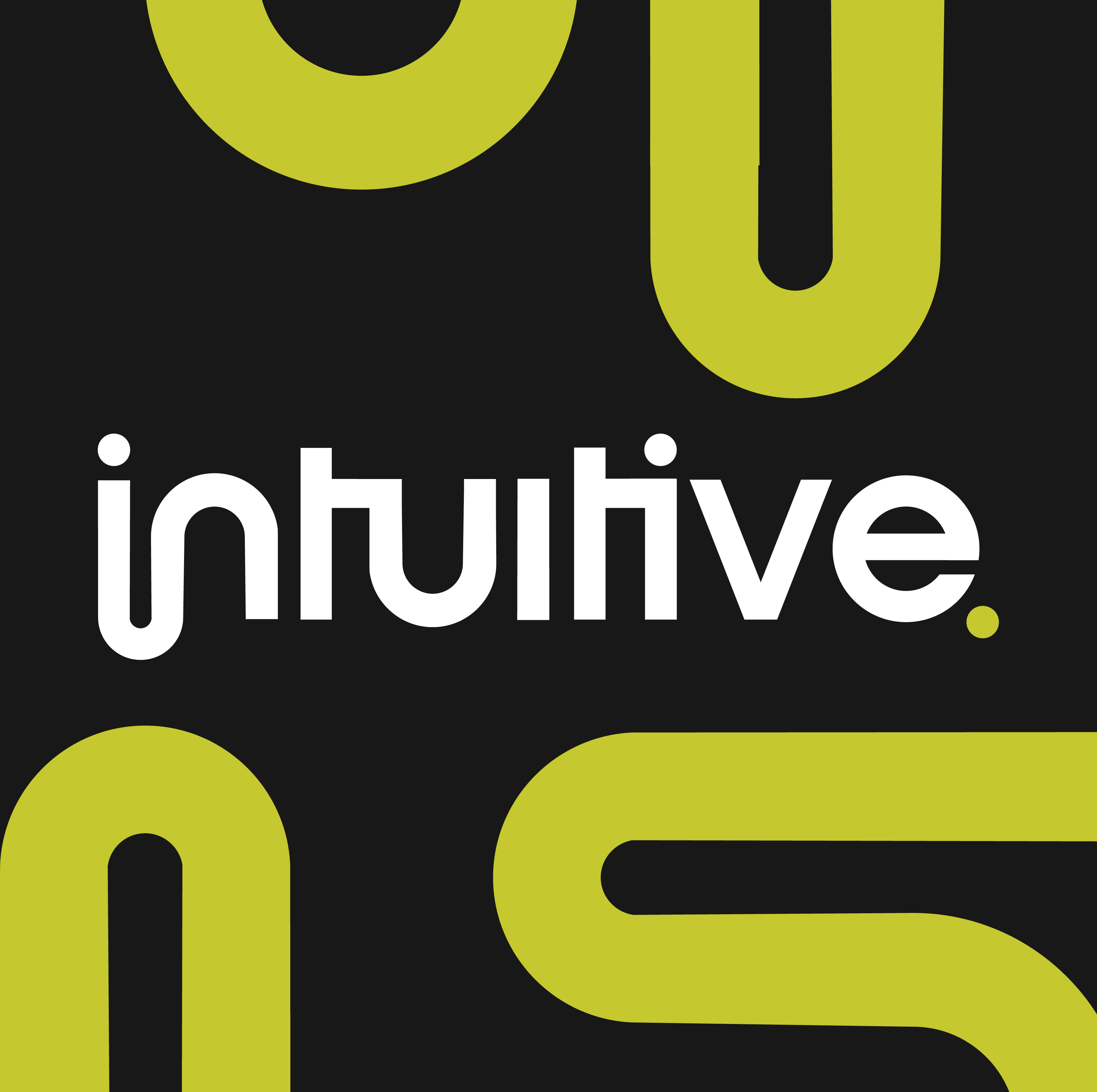


Intuitive Insurance Solutions Rebrand
2023/4As the designer behind the refresh of Intuitive Insurance Solutions’ branding, the decision to embark on redesigning the logo in its entirety was rooted in fact that the previous logo- its harsh and angular lines, felt dated and entrenched in the design aesthetics of the 2000’s. My mission was clear: infuse a delightful sense of smooth minimalism into the logotype whilst staying true to the brand’s core elements. We have retained the iconic pop green and introduced the subtle grey accent with abstract office photography, with the aim to create a timeless appeal.


UNSW Body Positivity
2023UNSW's Diversity Fest acts as a catalyst for meaningful dialogue and reflection, encouraging the community to embrace diversity as a wellspring of creativity, strength, and collective progress. I developed an illustrated art installation, specifically curated for this event, with the purpose to celebrating the intrinsic beauty of diversity, advocating for equality, and fostering a sense of vibrant togetherness within the community.


UNSW Wayfinding
2023Graphic & illustrative pieces of wayfinding, designed for the bustling Village Green Sports Precinct and main campus at UNSW, Sydney. Following UNSW’s brand guidelines, whilst maintaining a youthful vibrancy with the type treatment and visual style.
Simplifying navigation while upholding the university's identity, the work seamlessly guides students through the dynamic campus environment, creating an engaging and intuitive experience.
With ArcUNSW, ArcSport and UNSW


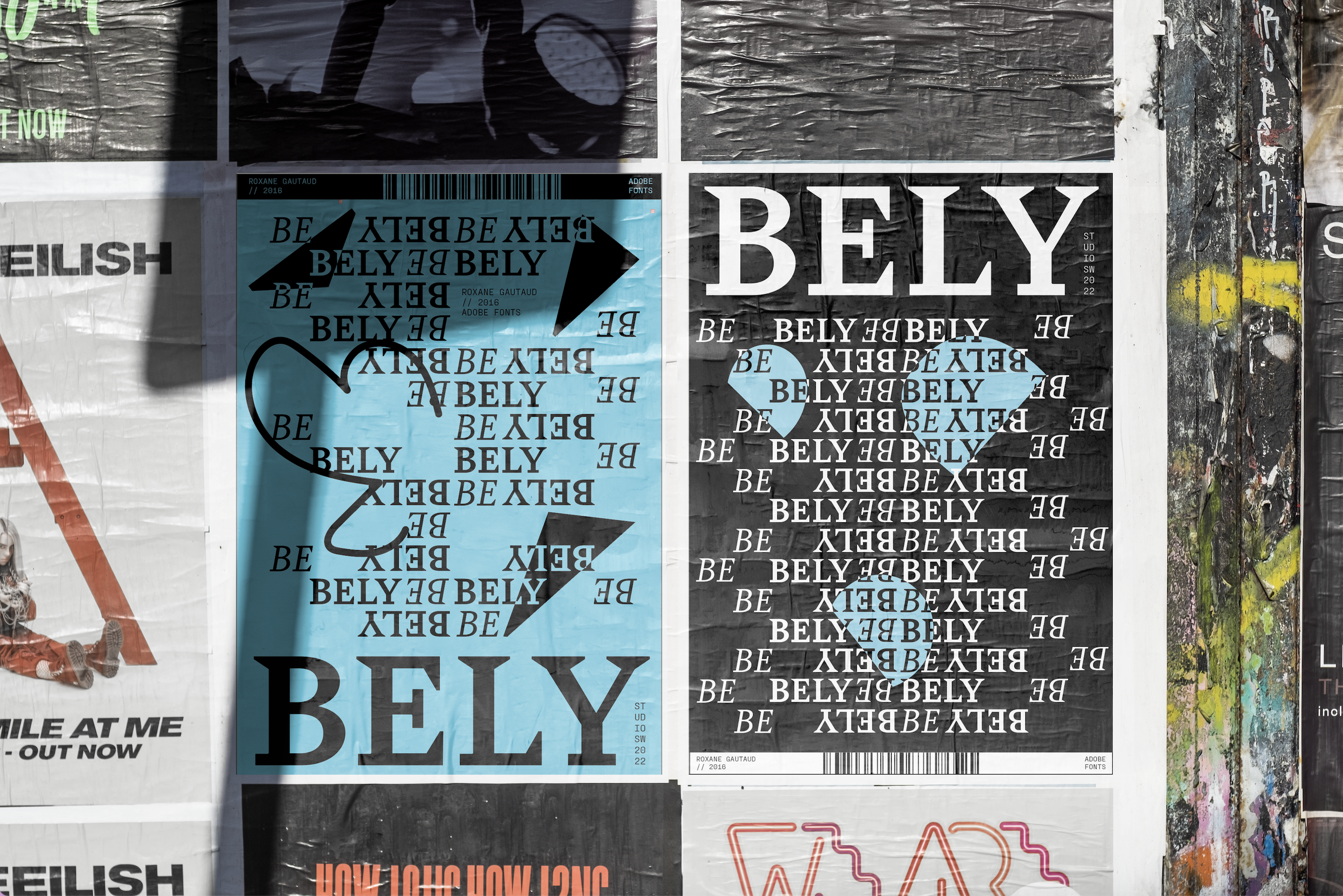
BELY Typeface Campaign
2022In response to the kinetic typography brief, a set of dynamic & animated rave posters featuring the hero typeface Bely by Roxane Gautaud was developed. Designed to be featured outside the likes of Oxford Arts Factory and techno events- the typography and use of abstract shapes timed to the beat of the techno DJ tunes highlights the hype as we enter the event packed Spring Season.
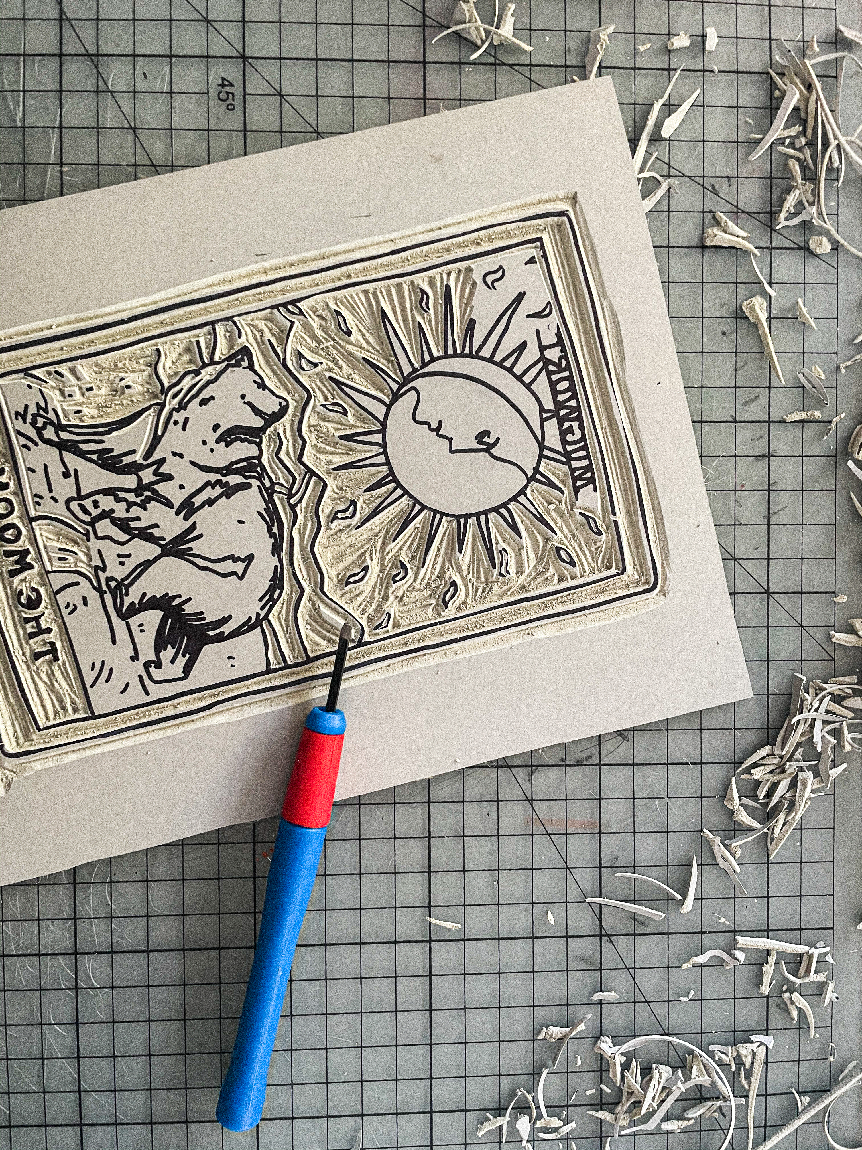
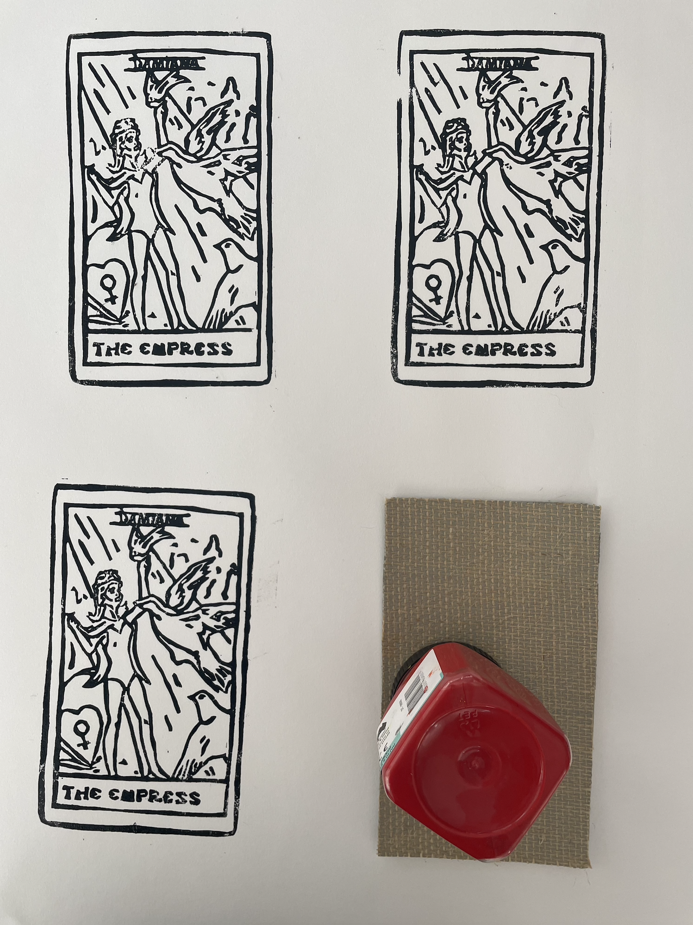
La Lune
2021︎AGDA MERIT WINNER- Packaging
My brand ‘La Lune’ organic herbs is targeted at a consumer aware of their body, mind and soul. Based around the concept of Tarot Cards and the notion of self-awareness, my herbal mix trilogy have properties that directly align to the traditional meanings of ‘The Sun’, ‘The Moon’ and ‘The Empress’ in the Tarot deck. The design itself is organic, using monoprinting to wave to tradition, contrasted with the bright fluoro inks of the print designs themselves, aiming to catch the eye of the consumer in an organic marketplace or retailer.